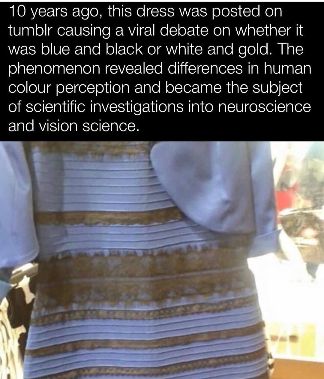
It appears white/gold to me on it’s own, I’ve never been able to see anything different.
Grabbing this specific image and sampling the colours though; they appear more of a grey/brown colour. I can sorta maybe understand blue, but definitely not black.
This is just using Polish photo editor on android:
Whatever the dress may be in reality, the photo of it that was circulated was either exposed or twiddled with such that the pixels it’s made of are indeed slightly bluish grey trending towards white (i.e. above 50% grey) and tanish browny gold.
That is absolutely not up for debate. Those are the color values of those pixels, end of discussion.
Edit to add: This entire debacle is a fascinating case of people either failing to or refusing to separate the concept of a physical object versus its very inaccurate representation. The photograph of the object is not the object: ce n’est pas une robe.
The people going around in this thread and elsewhere putting people down and calling them “stupid” or whatever else only because they know that the physical dress itself is black and blue based on external information are studiously ignoring the fact that this is not what the photograph of it shows. That’s because the photograph is extremely cooked and is not an accurate depiction. The debate only exists at all if one party or the other does not have the complete set of information, and at this point in history now that this stupid meme has been driven into the ground quite thoroughly I should hope that all of us do.
It’s true that our brains can and will interpret false color data based on either context or surrounding contrast, and it’s possible that somebody deliberately messed with the original image to amplify this effect in the first place. But the fact remains that arguing about what the dress is versus how it’s been inaccurately depicted is stupid, and anyone still trying that at this late stage is probably doing so in bad faith.
You missed the whole point. If I take a white dress and then shine a blue lamp on it, then take a photo.The pixels will be 100% blue, but would that mean the dress itself is blue?
The yellow background could be lit by another window or a different light source, so one could argue we don’t have a good reference to tell. But the point is that the “picture of a thing” is not “the thing” itself, and there is always a possibility that they are different.
If I showed you a picture of a green surface, and asked you what color it is, would you say that it’s white and that there’s probably green light shining on it?
No, but it doesn’t mean the other answer is invalid too. If there is no reference in the picture to tell what kind of light condition it was shot at, both answers could be possible.
So if we’re just going by what’s possible then the wall could be yellow and have a blue light, or it could be white with one yellow and one blue light.
Yes a very light blue, nobody is seeing brilliant white. But on a colour slider it’s much closer to white than the ‘true’ dark blue of the dress. If you sample the sleeve or whatever that is hanging over it’ll be even closer to pure white.
Earlier today I was sat in a dark room reading this thread, I looked at the picture above and it clearly had blue tones with warm dark grey. The dress was obviously blue/black.
I’m sitting outside in the light now, looking at the same picture on the same phone in the same app and now it’s white and gold/brown.
Without going on my pc and colour picking it myself I can’t tell what colour the picture really is since my eyes seem all to happy to lie to me about it.
They’re not stupid, their visual cortex just lacks the ability to calibrate to context. You can see in the picture that the scene is very brightly lit. If your visual cortex is in working order, you’ll adjust your perception of the colours. The picture reveals that some people struggle to do that.
fMRI studies show that white-and-gold perceivers exhibit more activity in frontal and parietal brain regions, suggesting that their interpretation involves more top-down processing. This means they are more, not less, engaged in contextual interpretation.
Some differences may relate to physiological traits like macular pigment density, which affects how much blue light is absorbed before reaching the retina. People with higher density tend to see white and gold
Color perception is not only about the visual cortex’s function but about the image’s properties and the brain’s inferential processes. You’d know this if you weren’t a dumb blue-n-black’er
How come the gold and whiters are simultaneously claiming they use more top down processing, AND that the pixels are white and gold? Looking at the pixel colour is bottom up processing.
If the dress is actually blue and black, how is doing more contextual processing supposed to get you a less accurate perception? Imagine if it was a snake and you needed to tell what colour it was so you’d know if it’s going to bite you. If your perception of the snake’s colour changes depending on the lighting, you’re going to die.
The correct interpretation of that study is that you white and golders are doing 10,000 calculations per second and they’re all wrong… Or, you know, the BOLD activation was in inhibitory pathways.
The claim mixes up how perception works and what people actually mean when they talk about top-down processing. White and gold viewers aren’t saying the pixels are literally white and gold—they’re saying the colors they perceive match most closely with that label, especially when those were the only options given. Many of them describe seeing pale blue and brown, which are the actual pixel values. That’s not bottom-up processing in the strict sense, because even that perception is shaped by how the brain interprets the image based on assumed lighting. You don’t just see wavelengths—you see surfaces under conditions your brain is constantly estimating. The dress image is ambiguous, so different people lock into different lighting models early in the process, and that influences what the colors look like. The snake example doesn’t hold up either. If the lighting changes and your perception doesn’t adjust, that’s when you’re more likely to get the snake’s color wrong. Contextual correction helps you survive, it doesn’t kill you. As for the brain scan data, higher activity in certain areas means more cognitive involvement, not necessarily error. There’s no evidence those areas were just shutting things down. The image is unstable, people resolve it differently, and that difference shows up in brain activity.
White and gold viewers aren’t saying the pixels are literally white and gold—they’re saying the colors they perceive match most closely with that label
I think all of the white-gold people are really condescending, explaining how their perception is correct and how blue-black people don’t understand the image. Also, if they explain how the image looks white-gold enough, that the blue-black people will be wrong.
explaining how their perception is correct and how blue-black people don’t understand the image.
Well the ones that do understand the image by definition won’t need it explained. There’s no ‘correct’, if we’re talking pixels/digital representation, it’s white-gold (or light-blue and brown if we’re being pedantic), if we’re talking about what the physical dress is, it’s blue and black.
If it were a white and gold dress and the light was reversed to shadow it’d likely be the other way about; some people would interpret it as the pixels displayed (blue and black), and others would subconsciously revert it to white and gold.
So you’re saying if there were a blue and black snake that bites with deadly venom, and a white and gold snake that’s harmless to people, you’d gain an evolutionary advantage from seeing the blue and black snake turn white and gold in the sun?
No, being able to see the same snake as the same colour by adjusting for ambient lighting conditions aids survival.
B) America can go fuck itself until it sorts out it’s Nazi problem. I still think Canada should enact a full trade embargo and take our business elsewhere.
The point has never been about the actual pixel color codes. It’s about how human perception doesn’t follow those objective metrics.
Distilled down, we perceive color and brightness in comparison to the surrounding scene. The checker shadow illusion is a clear example of the same color looking different.
So the color perception on the dress depends on how the brain decides to color correct the white balance of the scene.
I find it easy to switch back and forth between the two color combinations: If I assume that the scene is in full sun, then the dress looks blue and black. If I assume that it’s in the shade, but with a brightly-lit background, then it looks white and gold.
It’s funny how people will keep barking about it even when you slap them in the face with color picker which is mathematical display of the color. There is no “how brain is seeing things”. It’s literally WHAT THE COLOR IS. To call white with faint blue tint “blue” and what is clearly a “gold” shade can’t possibly be black. If photo was heavily manipulated through photo editing or lighting, that doesn’t prove anything at all. Or the question was stupid. No one was really asking “what color is the dress”, they were asking what colors are on the photo. And photo has no relation to the real dress because of light conditions manipulation or even photo editing.
This person doesn’t understand pixels lol. You picked one pixel. Pick 100 of them and average them. It’s in the white spectrum with a slight shade of blue hue. If you look at it on the color wheel, it’s well within white segment slightly towards the blue. When you zoom out of single pixels, it’s white that you get under cool white light. It’s still considered white.
As for gold, computer screens do not display gold in specular way how you see it with eyes.When you pick pixels, they will be in range of brown. Again, you don’t seem to underetand pixels. And ultimately, this is suppose to be black, remember? Where’s the black?
The “after” photos of a dress show dark blue with black lace details because it was not captured in bullshit lighting. Where is that on the picked pixels? Just like years ago we are once again arguing over bullshit doctored/manipulated/bad photo of a dress arguing what color it is. It’s beyond stupid and I can’t believe people are still this dumb to argue about colors that aren’t even there. I don’t care how dress actually looks, you showed me the photo of it and you’re asking me how the dress looks like on the photo, not in reality. The rest is within the color picker which is mathematical representation of colors that doesn’t give a shit how eyes work. And it picks very faint blue and brown (thats perceived by eyes as white and gold). Not dark blue and black.
No one was really asking “what color is the dress”, they were asking what colors are on the photo.
This is not my recollection of this at all. Everyone knows what physical colors are on the screen. If so people who see the image as white and gold wouldn’t have been shocked/angry to learn the dress is actually blue and black.
If they were asking about actual color of the dress that you cannot see, what the fuck is the point? That’s like saying, we put orange cat in fully closed box. What color is the cat? And you then claim it’s not orange, it’s black because there is no light inside the fully closed box so the cat is actually black. That’s the level of stupid argument with this stupid ass dress.
I can also shoot a white dress to look entirely blue because I’m gonna use cool white light at 9000 fucking Kelvins and fuck up the cameras white balance to make shit look anything but its actual color. I can also take a normal photo and then just drag some sliders in photo editor and fuck up colors and then ask some bullshit question about colors and then go like “well, achtually it’s not that color”.
It’s also funny when people argue it’s not actually white because color picker says it’s light blue. Firstly, color motherfucking temperature. Secondly, open color wheel and see where it’s positioned. It’s in the white segment mildly nudging towards blue. The part where I’m not gonna argue is perception of gradients. This isn’t “this gold color is actually black bullshit”, but actual science where people perceive correct colors differently. For someone a certain gradient of red is perceived as lighter or darker compared to someone else. But certainly isn’t perceived as green. Or black. Or whatever other basic color.
It’s also funny when people argue it’s not actually white because color picker says it’s light blue. Firstly, color motherfucking temperature.
It’s because it seems like about half of people’s eyes and brains correct it one way and the other half the other way, leading to extremely heated discussions about “how can you not see it my way.” This isn’t like other optical illusions like that silhouette of a spinning ballerina where you can easily flip it around in your mind. I’ve only ever seen this as white and gold once and it took someone putting it upside down and very slowly zooming out from a very specific area of the dress.


It appears white/gold to me on it’s own, I’ve never been able to see anything different.
Grabbing this specific image and sampling the colours though; they appear more of a grey/brown colour. I can sorta maybe understand blue, but definitely not black.
This is just using Polish photo editor on android:
This is exactly the thing.
Whatever the dress may be in reality, the photo of it that was circulated was either exposed or twiddled with such that the pixels it’s made of are indeed slightly bluish grey trending towards white (i.e. above 50% grey) and tanish browny gold.
That is absolutely not up for debate. Those are the color values of those pixels, end of discussion.
Edit to add: This entire debacle is a fascinating case of people either failing to or refusing to separate the concept of a physical object versus its very inaccurate representation. The photograph of the object is not the object: ce n’est pas une robe.
The people going around in this thread and elsewhere putting people down and calling them “stupid” or whatever else only because they know that the physical dress itself is black and blue based on external information are studiously ignoring the fact that this is not what the photograph of it shows. That’s because the photograph is extremely cooked and is not an accurate depiction. The debate only exists at all if one party or the other does not have the complete set of information, and at this point in history now that this stupid meme has been driven into the ground quite thoroughly I should hope that all of us do.
It’s true that our brains can and will interpret false color data based on either context or surrounding contrast, and it’s possible that somebody deliberately messed with the original image to amplify this effect in the first place. But the fact remains that arguing about what the dress is versus how it’s been inaccurately depicted is stupid, and anyone still trying that at this late stage is probably doing so in bad faith.
The “white” pixels are literally blue. The “black” ones can be considered gold due to the lighting.
You missed the whole point. If I take a white dress and then shine a blue lamp on it, then take a photo.The pixels will be 100% blue, but would that mean the dress itself is blue?
But you can clearly see that the lighting is bright yellow-white, not blue…
The yellow background could be lit by another window or a different light source, so one could argue we don’t have a good reference to tell. But the point is that the “picture of a thing” is not “the thing” itself, and there is always a possibility that they are different.
If I showed you a picture of a green surface, and asked you what color it is, would you say that it’s white and that there’s probably green light shining on it?
No, but it doesn’t mean the other answer is invalid too. If there is no reference in the picture to tell what kind of light condition it was shot at, both answers could be possible.
So if we’re just going by what’s possible then the wall could be yellow and have a blue light, or it could be white with one yellow and one blue light.
That’s… literally not what this phenominon is about, either. Talk about missing the point.
That is literally what the argument is caused by, adaptive perception to lighting conditions.
That’s less than half of the related concepts.
It’s exactly the point. White fabric will appear blue in blue light, which is why some people see this white dress and think it’s blue.
Yes a very light blue, nobody is seeing brilliant white. But on a colour slider it’s much closer to white than the ‘true’ dark blue of the dress. If you sample the sleeve or whatever that is hanging over it’ll be even closer to pure white.
Earlier today I was sat in a dark room reading this thread, I looked at the picture above and it clearly had blue tones with warm dark grey. The dress was obviously blue/black.
I’m sitting outside in the light now, looking at the same picture on the same phone in the same app and now it’s white and gold/brown.
Without going on my pc and colour picking it myself I can’t tell what colour the picture really is since my eyes seem all to happy to lie to me about it.
They’re not stupid, their visual cortex just lacks the ability to calibrate to context. You can see in the picture that the scene is very brightly lit. If your visual cortex is in working order, you’ll adjust your perception of the colours. The picture reveals that some people struggle to do that.
fMRI studies show that white-and-gold perceivers exhibit more activity in frontal and parietal brain regions, suggesting that their interpretation involves more top-down processing. This means they are more, not less, engaged in contextual interpretation.
Some differences may relate to physiological traits like macular pigment density, which affects how much blue light is absorbed before reaching the retina. People with higher density tend to see white and gold
Color perception is not only about the visual cortex’s function but about the image’s properties and the brain’s inferential processes. You’d know this if you weren’t a dumb blue-n-black’er
How come the gold and whiters are simultaneously claiming they use more top down processing, AND that the pixels are white and gold? Looking at the pixel colour is bottom up processing.
If the dress is actually blue and black, how is doing more contextual processing supposed to get you a less accurate perception? Imagine if it was a snake and you needed to tell what colour it was so you’d know if it’s going to bite you. If your perception of the snake’s colour changes depending on the lighting, you’re going to die.
The correct interpretation of that study is that you white and golders are doing 10,000 calculations per second and they’re all wrong… Or, you know, the BOLD activation was in inhibitory pathways.
The claim mixes up how perception works and what people actually mean when they talk about top-down processing. White and gold viewers aren’t saying the pixels are literally white and gold—they’re saying the colors they perceive match most closely with that label, especially when those were the only options given. Many of them describe seeing pale blue and brown, which are the actual pixel values. That’s not bottom-up processing in the strict sense, because even that perception is shaped by how the brain interprets the image based on assumed lighting. You don’t just see wavelengths—you see surfaces under conditions your brain is constantly estimating. The dress image is ambiguous, so different people lock into different lighting models early in the process, and that influences what the colors look like. The snake example doesn’t hold up either. If the lighting changes and your perception doesn’t adjust, that’s when you’re more likely to get the snake’s color wrong. Contextual correction helps you survive, it doesn’t kill you. As for the brain scan data, higher activity in certain areas means more cognitive involvement, not necessarily error. There’s no evidence those areas were just shutting things down. The image is unstable, people resolve it differently, and that difference shows up in brain activity.
I think all of the white-gold people are really condescending, explaining how their perception is correct and how blue-black people don’t understand the image. Also, if they explain how the image looks white-gold enough, that the blue-black people will be wrong.
Well the ones that do understand the image by definition won’t need it explained. There’s no ‘correct’, if we’re talking pixels/digital representation, it’s white-gold (or light-blue and brown if we’re being pedantic), if we’re talking about what the physical dress is, it’s blue and black.
If it were a white and gold dress and the light was reversed to shadow it’d likely be the other way about; some people would interpret it as the pixels displayed (blue and black), and others would subconsciously revert it to white and gold.
You’re saying it’s actually white-gold? Do you think the color on the left is actually white? White is on the right here, for your reference:
In the colors below, you think they are the same color? Brown is not the same color as gold
If you were tasked with painting something gold, would you paint it brown instead?
So you’re saying if there were a blue and black snake that bites with deadly venom, and a white and gold snake that’s harmless to people, you’d gain an evolutionary advantage from seeing the blue and black snake turn white and gold in the sun?
No, being able to see the same snake as the same colour by adjusting for ambient lighting conditions aids survival.
That isn’t what’s happening it’s a low res overexposed photo that lacks visual cues not real life.
It doesn’t lack visual cues. I could tell it’s overexposed and adjust for the lighting. You just can’t see the cues, and that’s the difference.
Why not an American photo editor?
A) I’m not American
And
B) America can go fuck itself until it sorts out it’s Nazi problem. I still think Canada should enact a full trade embargo and take our business elsewhere.
I mean… it was a dumb joke on Polish and Polish being homographs, but okay.
Woops
I missed that; bit of a sensitive topic atm…
Why are people downvoting someone for admitting they made a mistake? It takes some courage to do that.
Probably because they qualified it by making an excuse for themself instead of just owning the error without ‘strings attached’.
I’m American. You have full permission to shit on us whenever you want. This place fucking sucks.
Next up: the dress worn by the woman on the right.
The point has never been about the actual pixel color codes. It’s about how human perception doesn’t follow those objective metrics.
Distilled down, we perceive color and brightness in comparison to the surrounding scene. The checker shadow illusion is a clear example of the same color looking different.
So the color perception on the dress depends on how the brain decides to color correct the white balance of the scene.
I find it easy to switch back and forth between the two color combinations: If I assume that the scene is in full sun, then the dress looks blue and black. If I assume that it’s in the shade, but with a brightly-lit background, then it looks white and gold.
For the millionth time, the camera perceived it that way, not a human eye.
It’s funny how people will keep barking about it even when you slap them in the face with color picker which is mathematical display of the color. There is no “how brain is seeing things”. It’s literally WHAT THE COLOR IS. To call white with faint blue tint “blue” and what is clearly a “gold” shade can’t possibly be black. If photo was heavily manipulated through photo editing or lighting, that doesn’t prove anything at all. Or the question was stupid. No one was really asking “what color is the dress”, they were asking what colors are on the photo. And photo has no relation to the real dress because of light conditions manipulation or even photo editing.
This is the color picker in the image you replied to. Do you really think the colors on the left are white and the colors on the right are gold?
This person doesn’t understand pixels lol. You picked one pixel. Pick 100 of them and average them. It’s in the white spectrum with a slight shade of blue hue. If you look at it on the color wheel, it’s well within white segment slightly towards the blue. When you zoom out of single pixels, it’s white that you get under cool white light. It’s still considered white.
As for gold, computer screens do not display gold in specular way how you see it with eyes.When you pick pixels, they will be in range of brown. Again, you don’t seem to underetand pixels. And ultimately, this is suppose to be black, remember? Where’s the black?
The “after” photos of a dress show dark blue with black lace details because it was not captured in bullshit lighting. Where is that on the picked pixels? Just like years ago we are once again arguing over bullshit doctored/manipulated/bad photo of a dress arguing what color it is. It’s beyond stupid and I can’t believe people are still this dumb to argue about colors that aren’t even there. I don’t care how dress actually looks, you showed me the photo of it and you’re asking me how the dress looks like on the photo, not in reality. The rest is within the color picker which is mathematical representation of colors that doesn’t give a shit how eyes work. And it picks very faint blue and brown (thats perceived by eyes as white and gold). Not dark blue and black.
You are absolutely right. How most people don’t seem to get this fact is beyond me.
This is not my recollection of this at all. Everyone knows what physical colors are on the screen. If so people who see the image as white and gold wouldn’t have been shocked/angry to learn the dress is actually blue and black.
If they were asking about actual color of the dress that you cannot see, what the fuck is the point? That’s like saying, we put orange cat in fully closed box. What color is the cat? And you then claim it’s not orange, it’s black because there is no light inside the fully closed box so the cat is actually black. That’s the level of stupid argument with this stupid ass dress.
I can also shoot a white dress to look entirely blue because I’m gonna use cool white light at 9000 fucking Kelvins and fuck up the cameras white balance to make shit look anything but its actual color. I can also take a normal photo and then just drag some sliders in photo editor and fuck up colors and then ask some bullshit question about colors and then go like “well, achtually it’s not that color”.
It’s also funny when people argue it’s not actually white because color picker says it’s light blue. Firstly, color motherfucking temperature. Secondly, open color wheel and see where it’s positioned. It’s in the white segment mildly nudging towards blue. The part where I’m not gonna argue is perception of gradients. This isn’t “this gold color is actually black bullshit”, but actual science where people perceive correct colors differently. For someone a certain gradient of red is perceived as lighter or darker compared to someone else. But certainly isn’t perceived as green. Or black. Or whatever other basic color.
It’s because it seems like about half of people’s eyes and brains correct it one way and the other half the other way, leading to extremely heated discussions about “how can you not see it my way.” This isn’t like other optical illusions like that silhouette of a spinning ballerina where you can easily flip it around in your mind. I’ve only ever seen this as white and gold once and it took someone putting it upside down and very slowly zooming out from a very specific area of the dress.
So that’s why people were so torn about it.
You should watch https://youtu.be/bg41XfnIBvk for an explanation on how to properly get the colors from the image.