fMRI studies show that white-and-gold perceivers exhibit more activity in frontal and parietal brain regions, suggesting that their interpretation involves more top-down processing. This means they are more, not less, engaged in contextual interpretation.
Some differences may relate to physiological traits like macular pigment density, which affects how much blue light is absorbed before reaching the retina. People with higher density tend to see white and gold
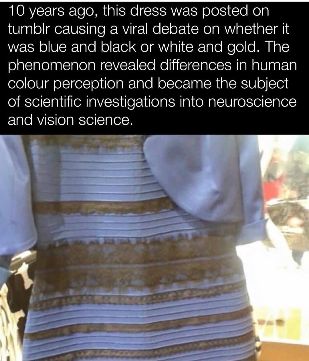
Color perception is not only about the visual cortex’s function but about the image’s properties and the brain’s inferential processes. You’d know this if you weren’t a dumb blue-n-black’er
How come the gold and whiters are simultaneously claiming they use more top down processing, AND that the pixels are white and gold? Looking at the pixel colour is bottom up processing.
If the dress is actually blue and black, how is doing more contextual processing supposed to get you a less accurate perception? Imagine if it was a snake and you needed to tell what colour it was so you’d know if it’s going to bite you. If your perception of the snake’s colour changes depending on the lighting, you’re going to die.
The correct interpretation of that study is that you white and golders are doing 10,000 calculations per second and they’re all wrong… Or, you know, the BOLD activation was in inhibitory pathways.
The claim mixes up how perception works and what people actually mean when they talk about top-down processing. White and gold viewers aren’t saying the pixels are literally white and gold—they’re saying the colors they perceive match most closely with that label, especially when those were the only options given. Many of them describe seeing pale blue and brown, which are the actual pixel values. That’s not bottom-up processing in the strict sense, because even that perception is shaped by how the brain interprets the image based on assumed lighting. You don’t just see wavelengths—you see surfaces under conditions your brain is constantly estimating. The dress image is ambiguous, so different people lock into different lighting models early in the process, and that influences what the colors look like. The snake example doesn’t hold up either. If the lighting changes and your perception doesn’t adjust, that’s when you’re more likely to get the snake’s color wrong. Contextual correction helps you survive, it doesn’t kill you. As for the brain scan data, higher activity in certain areas means more cognitive involvement, not necessarily error. There’s no evidence those areas were just shutting things down. The image is unstable, people resolve it differently, and that difference shows up in brain activity.
White and gold viewers aren’t saying the pixels are literally white and gold—they’re saying the colors they perceive match most closely with that label
I think all of the white-gold people are really condescending, explaining how their perception is correct and how blue-black people don’t understand the image. Also, if they explain how the image looks white-gold enough, that the blue-black people will be wrong.
explaining how their perception is correct and how blue-black people don’t understand the image.
Well the ones that do understand the image by definition won’t need it explained. There’s no ‘correct’, if we’re talking pixels/digital representation, it’s white-gold (or light-blue and brown if we’re being pedantic), if we’re talking about what the physical dress is, it’s blue and black.
If it were a white and gold dress and the light was reversed to shadow it’d likely be the other way about; some people would interpret it as the pixels displayed (blue and black), and others would subconsciously revert it to white and gold.
So you’re saying if there were a blue and black snake that bites with deadly venom, and a white and gold snake that’s harmless to people, you’d gain an evolutionary advantage from seeing the blue and black snake turn white and gold in the sun?
No, being able to see the same snake as the same colour by adjusting for ambient lighting conditions aids survival.
I can see them with my own eyes right now. And the dress is black and blue, so I’m right. You just can’t see them, but don’t mistake your eyesight problems for objective truth.


fMRI studies show that white-and-gold perceivers exhibit more activity in frontal and parietal brain regions, suggesting that their interpretation involves more top-down processing. This means they are more, not less, engaged in contextual interpretation.
Some differences may relate to physiological traits like macular pigment density, which affects how much blue light is absorbed before reaching the retina. People with higher density tend to see white and gold
Color perception is not only about the visual cortex’s function but about the image’s properties and the brain’s inferential processes. You’d know this if you weren’t a dumb blue-n-black’er
How come the gold and whiters are simultaneously claiming they use more top down processing, AND that the pixels are white and gold? Looking at the pixel colour is bottom up processing.
If the dress is actually blue and black, how is doing more contextual processing supposed to get you a less accurate perception? Imagine if it was a snake and you needed to tell what colour it was so you’d know if it’s going to bite you. If your perception of the snake’s colour changes depending on the lighting, you’re going to die.
The correct interpretation of that study is that you white and golders are doing 10,000 calculations per second and they’re all wrong… Or, you know, the BOLD activation was in inhibitory pathways.
The claim mixes up how perception works and what people actually mean when they talk about top-down processing. White and gold viewers aren’t saying the pixels are literally white and gold—they’re saying the colors they perceive match most closely with that label, especially when those were the only options given. Many of them describe seeing pale blue and brown, which are the actual pixel values. That’s not bottom-up processing in the strict sense, because even that perception is shaped by how the brain interprets the image based on assumed lighting. You don’t just see wavelengths—you see surfaces under conditions your brain is constantly estimating. The dress image is ambiguous, so different people lock into different lighting models early in the process, and that influences what the colors look like. The snake example doesn’t hold up either. If the lighting changes and your perception doesn’t adjust, that’s when you’re more likely to get the snake’s color wrong. Contextual correction helps you survive, it doesn’t kill you. As for the brain scan data, higher activity in certain areas means more cognitive involvement, not necessarily error. There’s no evidence those areas were just shutting things down. The image is unstable, people resolve it differently, and that difference shows up in brain activity.
I think all of the white-gold people are really condescending, explaining how their perception is correct and how blue-black people don’t understand the image. Also, if they explain how the image looks white-gold enough, that the blue-black people will be wrong.
Well the ones that do understand the image by definition won’t need it explained. There’s no ‘correct’, if we’re talking pixels/digital representation, it’s white-gold (or light-blue and brown if we’re being pedantic), if we’re talking about what the physical dress is, it’s blue and black.
If it were a white and gold dress and the light was reversed to shadow it’d likely be the other way about; some people would interpret it as the pixels displayed (blue and black), and others would subconsciously revert it to white and gold.
You’re saying it’s actually white-gold? Do you think the color on the left is actually white? White is on the right here, for your reference:
In the colors below, you think they are the same color? Brown is not the same color as gold
If you were tasked with painting something gold, would you paint it brown instead?
No it’s a very light blue that looks like white+shadow.
The gold is a browny gold but the options were ‘white and gold’ or ‘blue and black’
https://lemmy.dbzer0.com/pictrs/image/1af486db-deb1-44da-8d48-6ad5b5833713.webp
I see these exact pixels for the whole dress. So no black, and no blue like the original physical dress.
And no white. The only issue with the photo is that the black isn’t captured as absolute black and it’s a brown color.
Brown with a gold tint yes.
And blue so light it could be mistaken for white.
So you’re saying if there were a blue and black snake that bites with deadly venom, and a white and gold snake that’s harmless to people, you’d gain an evolutionary advantage from seeing the blue and black snake turn white and gold in the sun?
No, being able to see the same snake as the same colour by adjusting for ambient lighting conditions aids survival.
That isn’t what’s happening it’s a low res overexposed photo that lacks visual cues not real life.
It doesn’t lack visual cues. I could tell it’s overexposed and adjust for the lighting. You just can’t see the cues, and that’s the difference.
No, it does. That’s the point lol. Go read the Wikipedia thicko
I can see them with my own eyes right now. And the dress is black and blue, so I’m right. You just can’t see them, but don’t mistake your eyesight problems for objective truth.
lol ok Neo.
Unfortunately you’re unable to see the (objective) pixel representation :(