

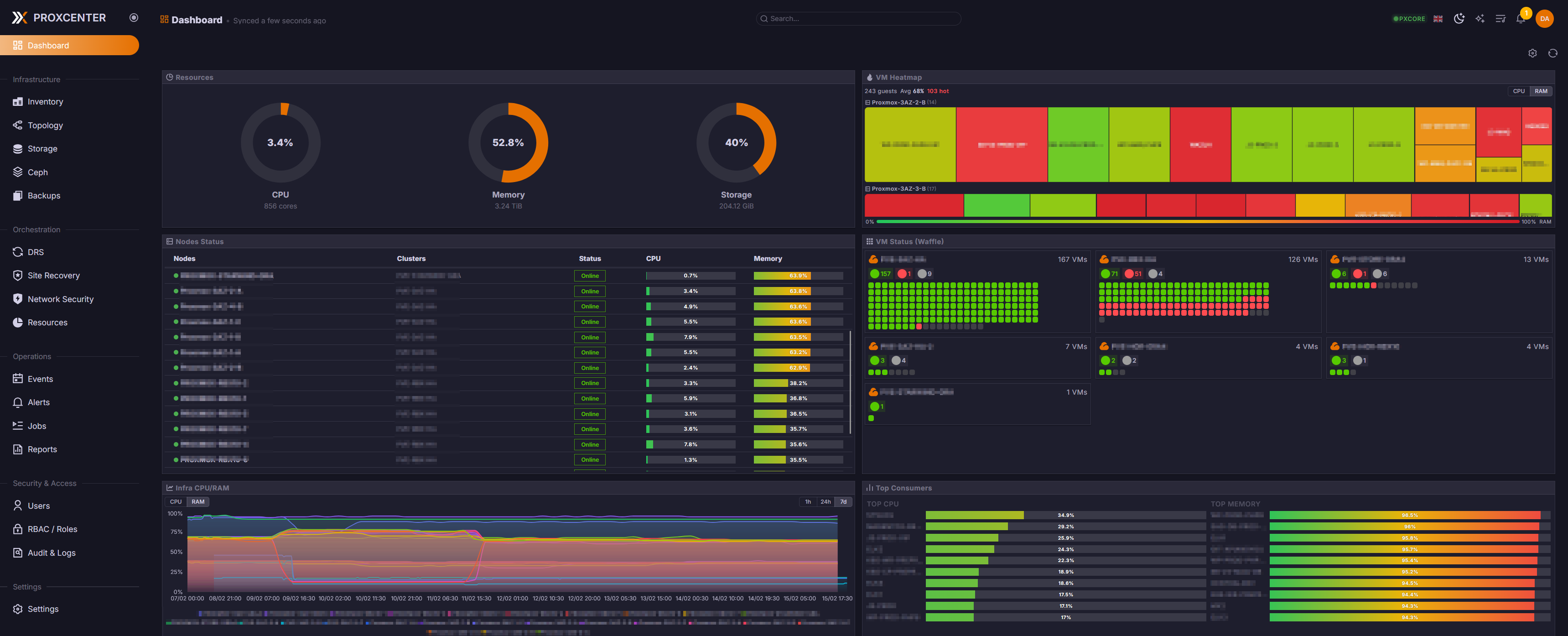
I just recently stumbled on this and I’ve never heard anyone here that uses it. It looks quite interesting. A dash for your Proxmox server.
The live demo looks jammy: https://demo.proxcenter.io/
The docs look quite comprehensive: https://docs.proxcenter.io/
Github: https://github.com/adminsyspro/proxcenter-ui
Runs in a Docker container. There is an community version and an enterprise version. I think I’m going to bump this up the Projects list to the top.
It’s super douchey when people show their GitHub stars.
How so? It’s one of the things I check in addition to last update, etc.
Douchey little popularity contests do not mean code is good. It’s misleading just like upvotes. It’s just what social media loving developers do. Most respectable (not all) projects avoid making a big deal out of it. It already shows it on GitHub. Why show it again? To be douchey?
Hmmm
Doesn’t mean it’s bad either, but warrants checking out.
I guess I just don’t see it as douchey. To me is says, ‘hey this might be worth checking out.’ Besides Lemmy and a couple of long standing forums, I really don’t do social media so perhaps I not as jaded.
I mean it’s a metric. Not a perfect one, but it helps to get an overview of the state of a repository.
No it doesn’t. Popularity contest only.