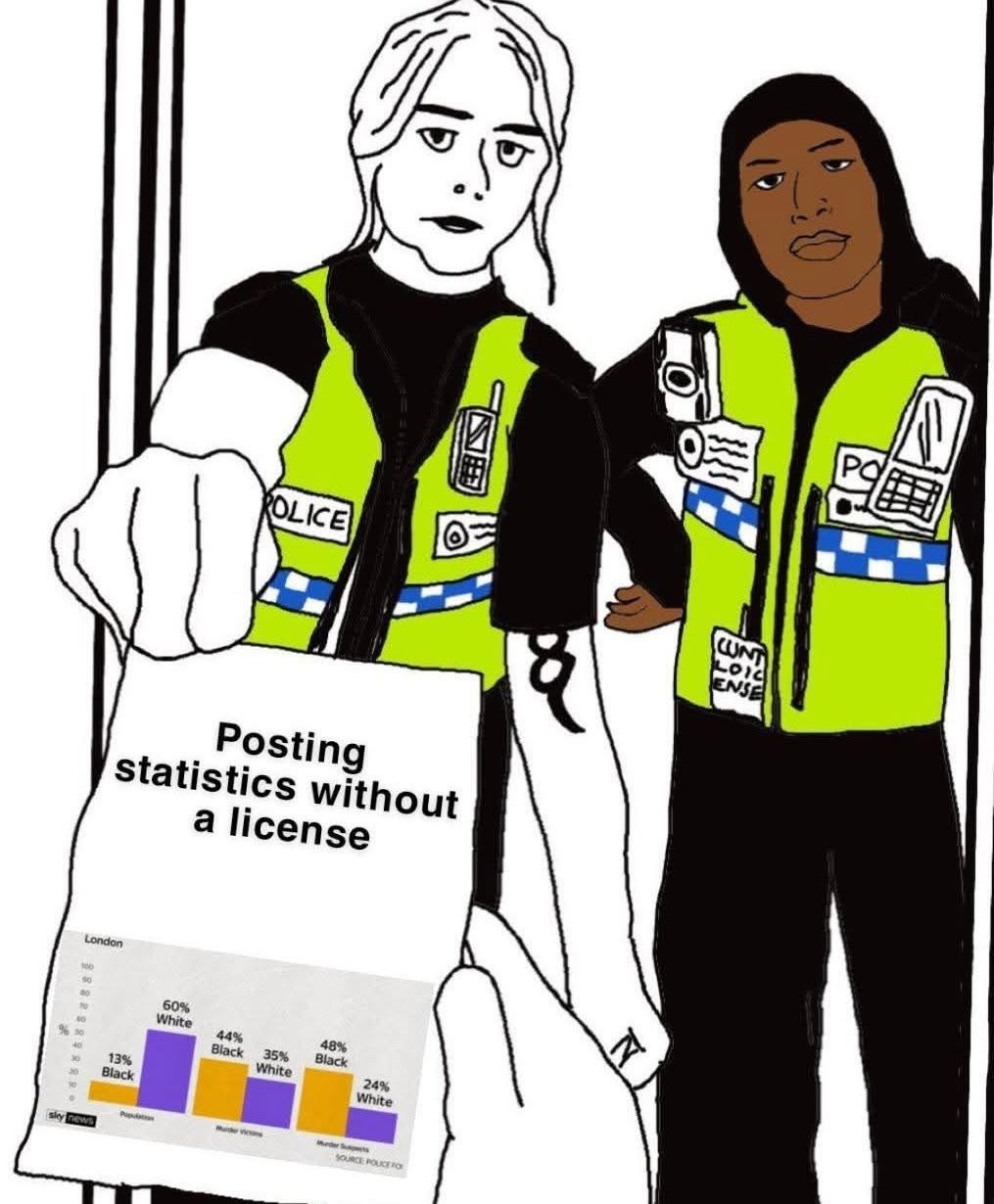
I totally read those stats differently, that black people are more likely to be murder suspects (not convicted necessarily but let’s be real) because of systematic racism. White people can’t possibly be murderers, right guys??? But I also am not familiar with the meme background so maybe that’s skewing my reading of it.
I’m also not familar with the template. But it should speak for itself anyway. Diagrams are always selections. If you want a complete data representation you would need a table. If the author of the diagram wanted to show the effect of racial prejudices it would show the actually convicted offenders. There is enough space for another column.