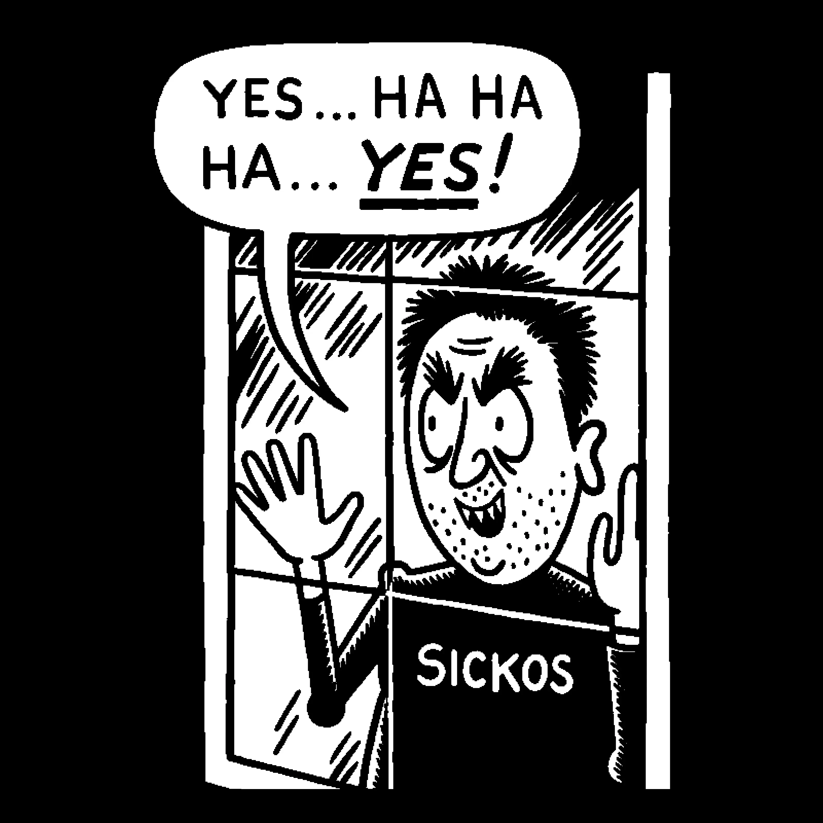
I don’t even know what it’s called, but I really hope it goes the way of Comic Sans
Edit: does anyone actually know what this awful font is called?
Comic Sans was hand-crafted, technically excellent, highly legible and served it’s purpose perfectly. The only thing it has in common with this shite is that people used it for fucking e-v-e-r-y-t-h-i-n-g.

It’s the iconic design for this generation and in 10 or 15 years, people will be nostalgic for that
I love comic sans just because it’s the easiest to read. I write everything in comic sans and then reformat afterwards.
Is there a monospaced version of comic sans for programming?
Yes: https://dtinth.github.io/comic-mono-font/
I used it for a while thinking it helped me, but actually turns out I just needed a bigger font size
Sloppy sans
It’s apparently not just limited to English. Not that it would be, guess I just never thought about it.

It’s either this shit or the fucking humanoid robot in every tech related post touching a holo screen showing completely pointless and unrelated data

The explosion of shitty illustrations attached to every tech article has been so hideous to behold. Somehow even worse than the fact that so many of them are totally pointless slop.
I dislike the font, but I REALLY fucking hate what they’re doing with food. It’s like they’re all using the same horrible model that has never seen hashbrowns and BBQ sauce. You ask midjounrey for a steak, it makes you a convincing steak. It’s like every restaurant in every country is set on tryptophobic food
You’re absolutely right to push bwck on this, it is a dogshit slop-font.
What else can i help you with today?
Is this Comic Sans Italic?
The essential qualities of a good typeface balance visual beauty with practical function. This is just plain ugly and makes Comic sans look elegant. Using this crud is as acceptable as attending a funeral dressed as a clown.

Comic Sans was - is - a frigging superb font. It was destroyed by being abused.
That’s more like using Comic Sans for the obituary
I know multiple people that would want clowns at their funerals
Is it actually a font? No same letter looks the same - look at every ‘S’ for example, they all differ. Very similar but not the same. Maybe its just slop?
There is a real font called road rage
A few of the half decent, small YouTube channels I follow started using it in their thumbnails as a way to polish up their channel. Little do they know is all it does is suck the soul out of their content.
I have developed a rule for myself. If I see a channel using genAI in their thumbnails, it goes on the do not recommend this channel again list.
Me with anything LTT
I’ve been absolutely shocked walking through city centers and seeing these fucking AI flyers everywhere. Boycot whoever uses this shit and pay your local artists and graphic designers.
I am in Japan right now and they were selling postcards with AI images. Not even art made by humans…
I’ve seen that in a city I visited, three seperate shops with those and people were still there browsing
Meanwhile I was using a similar font on a lot of designs the last 20 years, and now it was basically stolen and can’t be used anymore 😭